10 Key Ingredients of a Good Web Design

When we started Eyebridge in 2004, the digital ecosystem was still in its developing stage. Since then we have infused creativity into everything we created on the web. We offer alternative solutions to our clients generating business for them & in the process create unforgettable beautiful experiences.
Now when we look back when we started making web designs, these 10 key ingredients have helped us to come this far and are still helping us to make the internet beautiful.
1. Know your customer
Always remember you are not making your website for yourself but for your clients or users. So it is very important to understand who he is, what is his age, what sort of education level he has and more importantly is he the end buyer or an influencer. For example, sometimes company owner is looking for digital marketing solutions but he asks his marketing manager or personal assistant to search for digital marketing companies. So in reality your user is a manager or a personal assistant.
Image Credits : www.studioone.com
If you understand your customer you can anticipate their needs and exceed their expectations. Investigate the data you hold on your customers, it can tell you a lot.
2. Finalise the objective of the website
So before even beginning with the designing process it is imperative to fix on the purpose of the website. Don’t just make a website for the sake of making a website, it can be your business’s best spokesperson or most outstanding sales person only if you connect the right dots. Unfortunately, many websites are too broad and lack a specific focus. This can confuse users and often leads to a disorganised look which leads to low ROI.
Broadly there are three types of objectives for any website-
1. Create Awareness: Generally high end brands like Pepsi or Tata focus on creating awareness about the brand with their website. They will either have very creative website or a very corporate looking website.
2. Generate more leads: Take an example of an education institute which is looking for students to join their next batch and their purpose is to get more inquiries from their website. So they will have to focus all their attention to generating leads.
3. Conversions: It is a very important purpose for any company who is selling their product or services online through their website. They have to make sure to put all their efforts in highlighting the merchandise very carefully on their website.
3. Don’t make users wait
It is a fact that when people search on Google for some information or product, they open at least 5-7 web pages. But they give just 3-5 seconds to decide whether they are going to further explore the website or not.
So it is very important that key purpose of the website is highlighted straightaway on the first go, don’t make them spend more time to understand who you are. Let’s look at the example of two Designing Institutes:
User generally sees a page in “F” Pattern. The banner above is the most attractive part of a website’s home page, has shown some animated graphics which says “Web designing, Animation & VFX”. Now the user will still not be clear whether this is education provider or website designing company. For this reason he is required to explore more even to make sure whether he is on the right website or not. Now let’s look at another website www.esac.in, which is also a digital design institute.

www.esac.in
Even with “F” pattern approach, the top Navigation is very clear and straight with contact details along with social media links to build trust. Most prominent part is the image of the person, which showcase somehow the target audience of this website i.e students or working professionals. The message is also very clear, highlighting the digital certification courses for 2016-17 for which admissions are open and with a clear call to action to know more. So this design will have much more chances of the user to stay rather than the previous one.
4. Design has to be Simple yet Attractive
Users have a simple mindset, they don’t read but they scan the website, they appreciate good quality and aesthetics, they are impatient and follow their intuition based on their behaviour.
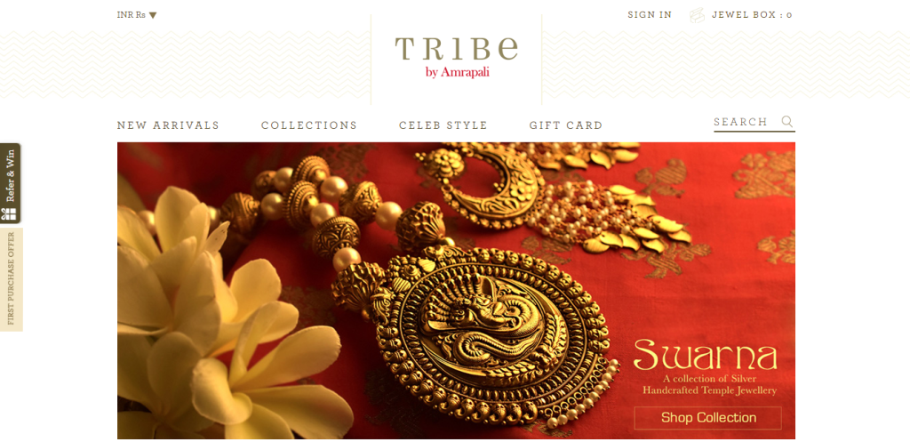
www.tribebyamrapali.com
At the end that’s also true that user will not come to your website to enjoy your design but for the relevant information. So design has to very Simple to navigate, easy to understand. Complex structures are harder to read, scan, analyse and work with.
5. Responsive for any device
Users today access information online from every device available from desktop to tablets to smartphones. If the information on your website is not accessible from the device the user is using then he will move on to the next website which is accessible from his device. Having a responsive layout for your website is essential because every user is important, you can’t ignore anyone!
A separate website for mobile is a concept of the past. A single website for every platform is easy to maintain and update according to the latest updates. Moreover, a responsive layout for your website also helps in Search Engine Optimization (SEO). Google tends to rank responsive website better than non-responsive ones.
6. Tell the story, content is the king
Your website is a narrative of your brand and if that is not narrated properly then users on your website will be as lost as your story. Storytelling creates an emotional connect with the users and holds them to know more. Similarly the content on your website should tell your brand’s story so well without a speed breaker that no user can disconnect.
Your marketing efforts will prove effective when you share quality content with users through your website. Quality content is not just about well written information but also about the value it provides to the user. A user will engage with your content only when he finds what he was searching for and then he might think of converting into your customer.
Parallax websites are the perfect example why telling stories with your content is the king.
7. Call to actions placement and relevance
Poorly placed & boring Call to Actions get a very limited attention of your users which will limit conversions on your website. Strong & relevant CTAs not only grabs your attention but also encourages clicks & help you achieve your business goals.
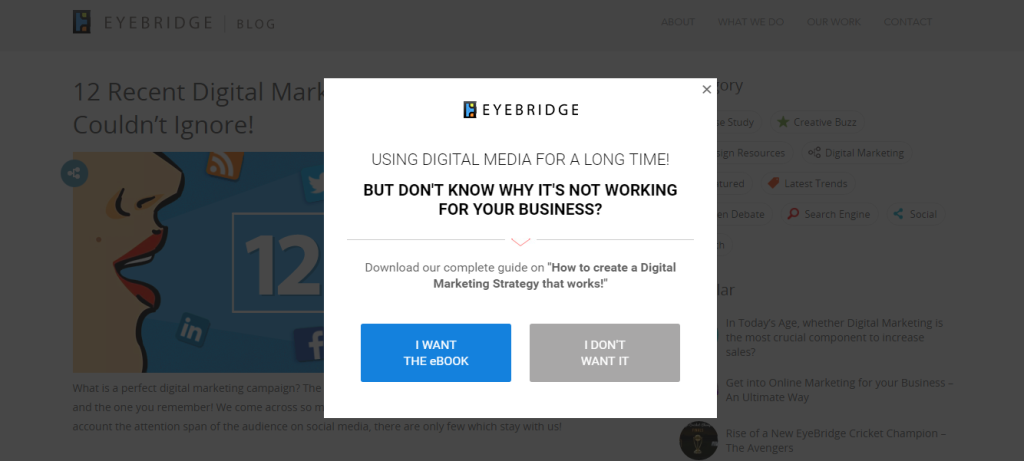
Imagine a situation where you have explained your product to the user very well & he gets interested but there is no button where he can buy or enquire about the product! There are 4 things you need keep in mind before creating your CTAs –
Text : The text of your CTA has be very clear & short to the point so that a user gets it right what you want him to do.
Placement : Choose the place for your CTA where you expect the user would be likely to take the action.
Size : The size of the button should not be too big or too small and should be easily identifiable as a CTA. Also, keep in mind that how will it appear on mobile.
Color : There should be enough white space around it & should stand out from rest of the page but should look a part of the website’s theme.
8. Fonts Style & Size
Creating good content is important but how it is presented makes the difference & will decide whether it will be read or not.
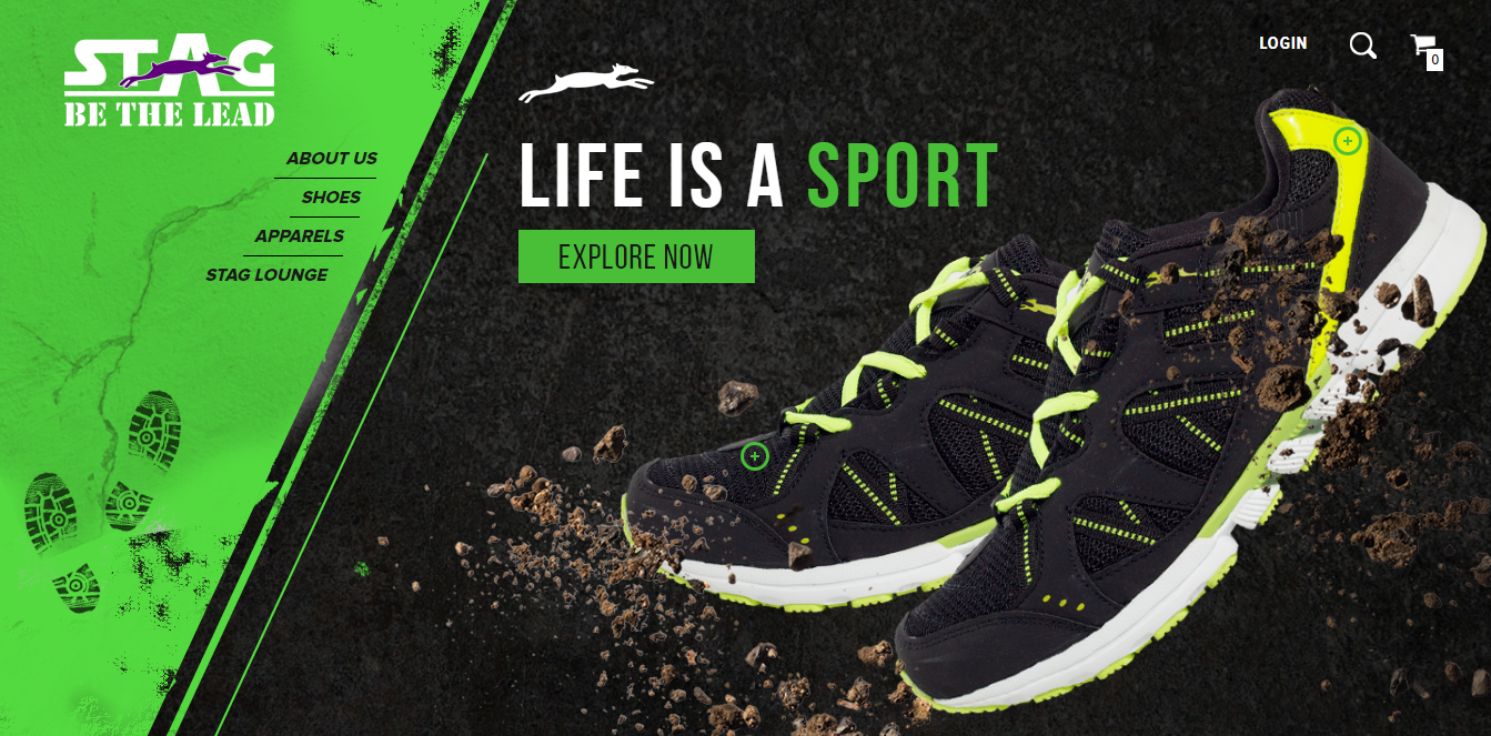
http://www.staglifestyle.com
One thing when you decide the font size you should keep in mind is Readability. Use at least 14 pixels for the font size so that content has a good readability on larger desktops and smartphones as well. Anything less than that will make your web page look like a book reducing the readability. Remember, the font style chosen by you will communicate your brand to your audience. Don’t make them to TRY reading your text, choose a font style that is easy to read and syncs with your brand. So, the big question is what is the right font for your website? There isn’t one but there is a group of font styles fit for your brand, you’ve to decide between simple or fancy.
9. Color Mix
Selecting the color scheme of your website’s design is a very important step. The color scheme chosen can make your website look like a beautiful landscape or a horror movie. The color choosing process can be simplified with these 4 steps-
i) Choose the color that describes your brand the best which should be dominant on your website.
ii) Choose colors that will complement your dominant color.
iii) Choose the background color that will complement the palette created above.
iv) Use the right colors at the right places.

http://expandustravel.com/
10. Testing, An Iterative Process
You’ve completed the design & development of your website, you’re happy with the outcome but is your job done? No, there is another step which people often forget i.e. Testing Your Website. This step will make sure there are no glitches in each street of your website which can turn off a visitor.
Create a comprehensive testing plan which covers every page of your website including their performance & functionality across all platforms and devices.
If you have any queries related to web design you can leave a comment below or contact us.
Join Web Designing Course

Related Posts
Comment using facebook: (0 comments)